Connect with us

Blogs

Complete History of Al Satwa: From 1970s to 2026

Published

on

Al Satwa Dubai history from the 1970s to 2026

The Complete History of Al Satwa: From 1970s to 2026 tells the story of one of Dubai’s most distinctive neighbourhoods. Located between Jumeirah, Bur Dubai and Sheikh Zayed Road, Al Satwa developed from a relatively low-rise residential district into a dense, multicultural urban community. Its history is closely connected with Dubai’s rapid expansion after the discovery of oil, the growth of national housing, changing patterns of migration and the city’s ambitious redevelopment plans.
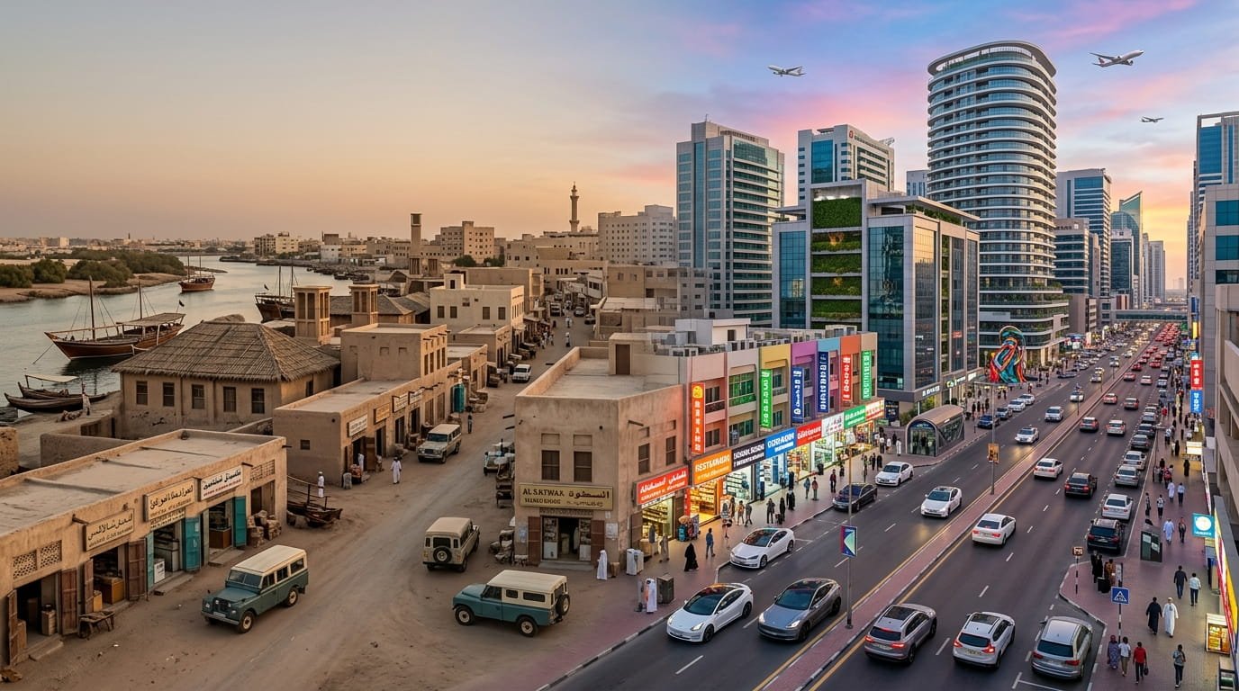
Unlike Dubai’s newer districts, Satwa still carries visible traces of an earlier urban landscape. Narrow streets, low-rise buildings, independent shops, tailors, restaurants, mosques and small businesses sit close to major roads and modern skyscrapers. As a result, the neighbourhood provides an unusual view of how Dubai changed from the 1970s onward without completely losing its older street-level character.

The story is also more complicated than a simple transformation from “old Dubai” to “modern Dubai.” Satwa experienced demographic change, redevelopment pressure, demolition and displacement, while its commercial and cultural life continued to attract new communities. By 2026, it remains one of central Dubai’s best-known low-rise neighbourhoods.

Where Is Al Satwa?

Al Satwa is a compact central Dubai community positioned between established districts including Jumeirah and Bur Dubai, with Sheikh Zayed Road forming its southern boundary. Its location has always influenced its development because the neighbourhood sits close to some of Dubai’s most important transport routes and urban centres.

The area is relatively small compared with many newer Dubai communities. Yet its central location gives it an importance that goes beyond its size.

The neighbourhood is associated with several recognizable places and roads, including:

  • Al Satwa Road
  • 2nd December Street
  • Satwa Grand Mosque
  • Al Satwa bus station
  • Iranian Hospital
  • Satwa Park
  • The Union House and the wider 2nd December Street area

The combination of residential streets and commercial corridors is one of Satwa’s defining characteristics.

Al Satwa Before the 1970s

The early history of Satwa is less thoroughly documented than the history of Dubai’s creek-side settlements.

Some modern websites describe the land as a sparsely developed area before Dubai’s rapid urban expansion, while local accounts associate the wider area with early Emirati settlement and traditional activities. However, detailed claims about the exact number of families living in Satwa before the 1970s should be treated cautiously because publicly available historical documentation is limited.

What is much clearer is that Dubai’s urban structure changed dramatically during the late 1960s and early 1970s.

Oil revenues gave the government greater resources for infrastructure and housing. At the same time, Dubai adopted new planning approaches designed to support rapid population and economic growth. Academic research into Dubai’s urban development identifies 1971–1993 as a major period of suburban growth.

Satwa became part of that transformation.

The 1970s: The Beginning of Modern Satwa

The 1970s are central to the Complete History of Al Satwa because this was the period when the neighbourhood became increasingly integrated into Dubai’s expanding urban system.

Research into Dubai’s national housing policies shows that the government began implementing a housing scheme in the late 1960s. Al Satwa was among the areas where land was provided to Emirati citizens as part of this broader housing approach.

This was significant because the neighbourhood was not initially conceived as one of the high-rise developments that would later define Dubai.

Instead, Satwa developed around relatively modest housing forms, including courtyard-style homes, low-rise structures and narrow streets. The resulting urban pattern was very different from the towers and master-planned communities that would appear elsewhere in Dubai decades later.

Local memories provide another perspective on this period.

A shopkeeper interviewed by Khaleej Times recalled arriving in Satwa in 1975, when there were few roads and water was scarce. Residents reportedly relied on water tanks, while the neighbourhood had a meat market and an open-air cinema showing Bollywood films.

These recollections are particularly useful because they show what Satwa looked and felt like at street level rather than simply describing it through planning documents.

Satwa in the Late 1970s

By the end of the 1970s, commercial activity was beginning to become an important part of Satwa’s identity.

One well-known example is Ravi Restaurant. Its owner told Khaleej Times that he opened the restaurant in 1978, when Satwa was still largely sandy and had only one market.

The story illustrates a broader pattern.

Small businesses could establish themselves in a neighbourhood that was still developing. As Dubai expanded, these businesses benefited from increasing numbers of residents, workers and visitors.

Consequently, Satwa gradually became more than a residential district. Shops, restaurants and everyday services became part of its identity.

The 1980s: Infrastructure and Community Growth

During the 1980s, Dubai continued to expand rapidly.

Road infrastructure improved, housing became more established and commercial activity increased. Satwa benefited from its central position because it was close to the growing Jumeirah area and the major road corridors connecting different parts of Dubai.

The neighbourhood’s low-rise character also became more firmly established.

Rather than developing as a single large project, Satwa evolved incrementally. Shops, homes, services and community facilities grew around existing streets.

That gradual development helps explain why Satwa can feel different from newer Dubai districts. Many newer communities were designed around a unified master plan, whereas Satwa accumulated layers over time.

The 1990s: A Major Demographic Change

The 1990s marked an important turning point in Satwa’s social history.

Academic research on the neighbourhood describes how many Emirati families moved toward newer suburban housing areas during the period. As a result, older national housing districts such as Satwa increasingly became occupied by expatriate workers and other residents.

At the same time, Dubai’s construction, service and retail sectors were expanding.

The city needed large numbers of workers, and migration from South Asia and the Philippines contributed significantly to the changing population of areas such as Satwa. Research describes the mid-1990s as an important period in this demographic transition.

This shift had lasting consequences.

Satwa gradually became known for its multicultural population, particularly its Indian, Pakistani, Bangladeshi, Filipino and Arab communities. Khaleej Times later described the neighbourhood as a multicultural area whose population had changed significantly from its earlier character.

Why Satwa Became Known as “Mini-Manila”

One of Satwa’s most recognizable modern descriptions is “Mini-Manila.”

The nickname reflects the neighbourhood’s strong Filipino community and the presence of Filipino-oriented businesses and services. However, Satwa is not exclusively Filipino.

Its streets also serve Indian, Pakistani, Bangladeshi, Arab and other communities. That broader diversity is one of the neighbourhood’s defining features.

The nickname therefore describes one important layer of Satwa’s identity rather than the entire neighbourhood.

This distinction matters because Satwa’s multicultural character developed through several waves of migration rather than a single community replacing another.

The 2000s: Dubai’s Rapid Transformation Reaches Satwa

The early 2000s brought an enormous change to Dubai.

High-rise developments, new roads and major commercial projects transformed the city’s skyline. Satwa’s location suddenly became even more valuable because it was close to emerging central business and luxury districts.

However, this strategic position also created pressure.

Satwa’s low-rise traditional urban fabric occupied land that could potentially support much larger developments. As Dubai became increasingly focused on large-scale redevelopment, the future of older neighbourhoods became a major question.

This was not simply a cosmetic change.

Researchers describe Satwa as an important case of urban redevelopment because traditional neighbourhood structures were demolished and residents were displaced during redevelopment efforts.

The 2007–2008 Redevelopment Controversy

One of the most significant chapters in the Complete History of Al Satwa concerns redevelopment plans announced during the late 2000s.

Academic research records that a large portion of Satwa was allocated to a semi-government developer in 2007 with plans to transform the area into a luxury district. Compensation was provided to local owners, and demolition began.

In 2008, a substantial part of the area was demolished.

However, the global financial crisis interrupted the redevelopment project. Researchers describe the project as being halted after the demolition of a large section of the neighbourhood.

This produced an unusual urban landscape.

Parts of the older neighbourhood disappeared, while other parts survived. The result was neither a complete preservation of old Satwa nor a total replacement with a new luxury district.

Why the 2008 Redevelopment Matters

The Satwa redevelopment story is important beyond the neighbourhood itself.

Urban researchers have used Satwa as a case study of how rapid redevelopment can affect:

  • Housing
  • Community networks
  • Cultural identity
  • Traditional urban form
  • Residents’ attachment to place
  • Low-income workers
  • Local businesses

Khaled Alawadi’s peer-reviewed research describes displacement and the destruction of cultural fabric as major consequences of redevelopment in Al Satwa. The research draws on government and historical documents, field observations and interviews with 30 Satwa residents.

This makes Satwa particularly valuable for understanding Dubai’s urban history.

The neighbourhood demonstrates that development is not simply about replacing old buildings with new ones. It can also reshape who lives in an area, how people interact and what kinds of businesses survive.

Satwa’s Commercial Identity

Despite redevelopment pressure, Satwa retained a strong street-level commercial culture.

The main roads are lined with restaurants, cafés, tailoring shops, fabric stores, supermarkets, electronics businesses, mobile-phone shops and other everyday services.

This commercial environment differs from Dubai’s large shopping malls.

Satwa’s businesses are often smaller and more specialized. Many are closely connected to the daily needs of residents and workers.

Tailoring is particularly associated with the neighbourhood. Food is another major attraction, with restaurants serving South Asian, Filipino and other cuisines.

As a result, Satwa became known not simply as a place to live but as a place where people from different parts of Dubai could shop, eat and access services.

Satwa and 2nd December Street

2nd December Street is one of the most historically significant roads associated with the area.

The street was formerly known as Diyafah Street and is closely connected to the wider history of the UAE. The Union House, where the UAE’s founding leaders signed the federation agreement in 1971, is located in the wider area.

That gives Satwa a geographical relationship with one of the most important moments in UAE history.

The road also became an important commercial corridor, with restaurants, cafés and shops contributing to the area’s everyday identity.

Al Satwa in the 2010s

During the 2010s, Satwa continued to experience the tension between preservation and modernization.

The neighbourhood remained low-rise in many sections, even as skyscrapers grew around it.

That contrast became one of Satwa’s most recognizable visual characteristics: older residential streets could exist within minutes of Dubai’s modern financial and tourism districts.

Local reporting from 2018 highlighted Satwa’s multicultural population and its collection of shops and restaurants. Residents interviewed for the report also recalled earlier decades, offering a living connection between the neighbourhood’s past and present.

Preserving Satwa’s Memory

Satwa’s history has increasingly been documented through photography, oral histories and cultural projects.

A notable example is “Satwa Stories,” a spoken-word and photographic project that documented characters and places associated with the neighbourhood.

More recently, a Dubai photography exhibition explored memories of older neighbourhoods and the changes brought by redevelopment. The National reported on the exhibition in 2023, highlighting the role of photography in preserving parts of Dubai’s urban memory that might otherwise disappear.

This is significant because buildings are not the only historical records.

A restaurant, shop, mosque, street corner or familiar business can also represent decades of community history.

Al Satwa From 2020 to 2026

By the 2020s, Satwa remained a mature central Dubai neighbourhood with a mixture of older buildings, commercial streets and newer development pressures.

Current area guides continue to describe it as a low-rise mixed-use community with apartments, villas, shops, offices and local services.

Its central location remains one of its biggest advantages.

Satwa is close to major parts of Dubai, including Jumeirah and the central business districts. At the same time, it maintains a more traditional street-level atmosphere than many surrounding areas.

Current descriptions also emphasize its continued multicultural character and lively retail environment.

What Makes Al Satwa Different in 2026?

Several characteristics continue to distinguish Satwa.

Characteristic Al Satwa in 2026
Urban form Mostly low-rise and compact
Main identity Residential and commercial
Population Highly multicultural
Retail Independent shops and local services
Food Strong South Asian, Filipino and other cuisines
Location Central Dubai near Jumeirah and Sheikh Zayed Road
History Strong links to Dubai’s 20th-century urban expansion
Development Older fabric alongside modernization
Community character Dense, active and street-oriented
Historical challenge Balancing redevelopment with local identity

The most important point is that Satwa has not remained frozen in the past.

Instead, it has repeatedly adapted to Dubai’s changing economy and population.

What Competitors Often Miss About Satwa’s History

One of the biggest weaknesses in simplified accounts of Satwa is that they treat the neighbourhood as either an “old Dubai” relic or simply a multicultural shopping district.

Neither description is complete.

Satwa’s history contains several overlapping phases.

First came the development of national housing and low-rise residential areas. Then came demographic change as Emirati families moved toward newer suburban housing. After that, the neighbourhood became increasingly important to expatriate workers and businesses. Finally, redevelopment pressure brought demolition and displacement while other parts of Satwa continued to survive.

This means Satwa’s identity is not based on one population or one architectural style.

Its identity comes from layers.

An older street may sit beside a newer building. A decades-old restaurant may operate near a modern business. A Filipino service shop may stand beside an Indian restaurant and an Emirati community institution.

That mixture is precisely what makes the neighbourhood historically interesting.

Why Al Satwa Still Matters to Dubai’s History

Satwa offers a useful alternative to the familiar story of Dubai’s development through skyscrapers and mega-projects.

The Burj Khalifa, Dubai Marina and other major developments represent one side of the city’s transformation.

Satwa represents another.

It shows what happened at the neighbourhood level as Dubai expanded. It demonstrates how housing policies, migration, commerce, road development and redevelopment affected an existing community.

In that sense, Satwa is not outside Dubai’s modernization story.

It is part of it.

Frequently Asked Questions

When did Al Satwa develop?

Al Satwa’s modern urban development is closely associated with the late 1960s and 1970s, when Dubai expanded its housing and infrastructure systems. Academic research identifies Al Satwa as one of the areas involved in the government’s national housing scheme during this period. Local residents also recall the neighbourhood as relatively undeveloped in the mid-1970s.

What was Al Satwa like in the 1970s?

According to resident recollections, Satwa in the 1970s had fewer roads and buildings than it does today. Water availability was more limited, and residents used shared water tanks. The neighbourhood also had a meat market and an open-air cinema that showed Bollywood films.

Why is Al Satwa famous?

Al Satwa attracts residents and visitors with its central location, low-rise urban character, multicultural population, independent shops, tailoring businesses, restaurants, and vibrant street life.
It is also historically important because of its connection to Dubai’s early urban expansion and its proximity to 2nd December Street and Union House.

Why is Satwa called Mini-Manila?

People associate the nickname “Mini-Manila” with Satwa’s large Filipino community and its concentration of Filipino-oriented businesses and services. However, the neighbourhood is much more diverse than the nickname suggests, with Indian, Pakistani, Bangladeshi, Arab and other communities also contributing to its identity.

What happened to Al Satwa during the 2008 redevelopment?

A major redevelopment plan led to the demolition of a substantial portion of Satwa in 2008. The planned transformation into a luxury district was subsequently interrupted during the global financial crisis. Academic research has examined the resulting displacement and loss of traditional neighbourhood fabric.

Is Al Satwa still a low-rise neighbourhood in 2026?

Yes, significant parts of Satwa continue to have a low-rise character. Current area guides describe the district as a mixed-use community containing low-rise residential buildings, villas, shops, offices and local services. At the same time, redevelopment and newer construction continue to influence the wider area.

Is Al Satwa historically important to Dubai?

Yes. Satwa is important because it reflects several stages of Dubai’s urban development, including national housing, suburban expansion, demographic change, expatriate migration, commercial growth and redevelopment. Its history also provides an example of the social and cultural effects that can accompany rapid urban transformation.

Conclusion

The Complete History of Al Satwa: From 1970s to 2026 is ultimately a history of adaptation.

Satwa developed during Dubai’s early period of rapid urban expansion, grew through the 1980s and 1990s, became increasingly multicultural, faced major redevelopment pressure in the 2000s and continued evolving through the 2010s and 2020s.

Yet the neighbourhood has retained something that many newer districts do not: a strong street-level identity built around small businesses, established communities and layers of urban history.

By 2026, Al Satwa is neither simply an old neighbourhood nor an untouched example of Dubai’s past. It is a living part of the city where older streets, multicultural commerce and modern development continue to exist alongside one another.

That layered character is what makes Satwa particularly valuable when understanding how Dubai changed from the 1970s to the present.

Continue Reading
Click to comment

Leave a Reply

Your email address will not be published. Required fields are marked *

Blogs

275 Cute Hello Kitty PFP Ideas for Aesthetic Profiles

Published

on

275 Cute Hello Kitty PFP collection with kawaii and aesthetic profile picture designs

A Cute Hello Kitty PFP can give a profile an instantly recognizable and playful look. From soft pink and pastel designs to Y2K, minimalist, matching, dark, and Pinterest-inspired styles, Hello Kitty profile pictures offer plenty of ways to personalize an online account. Search interest currently spans Instagram, Pinterest, TikTok, Discord, gaming profiles, and other social platforms, with users looking for different colors, moods, and editing styles.

Hello Kitty is an official Sanrio character, and Sanrio describes her as living with her parents and twin sister Mimmy. This guide explores 275 profile-picture ideas, explains the most popular styles, shows how to choose the right image, and covers an important point that many PFP collections overlook: image-use and copyright considerations.

What Makes a Cute Hello Kitty PFP Stand Out?

A profile picture is displayed much smaller than the original image. As a result, a design that looks impressive at full resolution may not work well when reduced to a small circular avatar.

A strong Hello Kitty PFP generally has:

  • A recognizable central subject
  • Clear contrast
  • Simple framing
  • A suitable color palette
  • Limited background clutter
  • Good image quality
  • Important details positioned away from the edges

Current Hello Kitty PFP collections commonly organize designs around aesthetics such as cute, Y2K, pink, matching, Pinterest, black, and minimalist styles.

The best choice depends less on the number of decorative elements and more on whether the image still looks clear after cropping.

Why Hello Kitty PFPs Remain Popular

Hello Kitty has a distinctive visual identity that can be recognized quickly. Sanrio identifies Hello Kitty as one of its well-known character properties, and the company owns the associated character names and images.

That recognition makes the character suitable for profile images. Users do not need to explain the reference before someone understands the general aesthetic.

The design can also be adapted to different moods without losing its recognizable identity.

For example:

  • Pink edits create a soft appearance.
  • Y2K designs add a nostalgic look.
  • Black backgrounds create stronger contrast.
  • Pastel colors create a calm aesthetic.
  • Matching images work well for friends.
  • Minimalist versions suit clean profiles.
  • Seasonal edits can reflect holidays or special occasions.

This flexibility explains why current PFP collections cover such a wide range of Hello Kitty styles.

275 Cute Hello Kitty PFP Styles to Explore

The 275-image concept works best when the collection covers different visual preferences rather than repeating the same design with minor changes.

1. Classic Cute Hello Kitty PFP

Classic designs keep the familiar Hello Kitty appearance at the center.

They often use:

  • White backgrounds
  • Red or pink accents
  • The recognizable bow
  • Simple expressions
  • Minimal decoration

This is a good option when you want an unmistakable Hello Kitty profile without a complicated aesthetic.

2. Pink Hello Kitty PFP

Pink remains one of the most recognizable choices for cute-themed profile images.

A pink PFP can use:

  • Baby pink
  • Hot pink
  • Blush
  • Rose
  • Pink and white
  • Pink and lavender

A useful design principle is to avoid using too many shades of pink. Two or three related tones usually create a cleaner appearance.

3. Pastel Hello Kitty PFP

Pastel designs replace stronger colors with softer tones such as lavender, cream, baby blue, pale pink, and mint.

This style works particularly well for:

  • Pinterest profiles
  • Journaling accounts
  • Lifestyle pages
  • Soft-aesthetic accounts
  • Personal social profiles

Pastel backgrounds can also make the profile image appear less visually aggressive when displayed beside colorful content.

4. Hello Kitty Y2K PFP

Y2K-inspired PFPs draw on early-2000s visual aesthetics.

Common elements include:

  • Glossy effects
  • Pink and silver
  • Sparkles
  • Hearts
  • Stars
  • Metallic details
  • Retro typography
  • Sticker-like graphics

Current Hello Kitty PFP collections frequently include Y2K as a separate category, showing how strongly the aesthetic connects the character with online nostalgia.

5. Hello Kitty Aesthetic PFP

An aesthetic PFP usually focuses on the overall mood rather than one specific color.

The design may use:

  • Soft lighting
  • Minimal backgrounds
  • Subtle grain
  • Muted colors
  • Gentle gradients
  • Decorative textures

The goal is to make the profile image feel cohesive rather than simply adding as many effects as possible.

6. Hello Kitty Pinterest PFP

Pinterest-inspired designs often have a carefully arranged, mood-board-like appearance.

They can include:

  • Scrapbook textures
  • Soft backgrounds
  • Collage elements
  • Neutral colors
  • Pastel palettes
  • Small decorative stickers
  • Balanced framing

Current PFP collections specifically categorize Pinterest-style Hello Kitty images around curated compositions and soft visual styling.

7. Cute Hello Kitty PFP for Instagram

Instagram displays profile pictures in a circular format, so composition matters.

For Instagram, choose an image where:

  • Hello Kitty is near the center
  • The bow is not cut off
  • The background is not overly busy
  • The important details remain inside the central area

A square source image is usually easier to crop than a wide image.

8. Hello Kitty PFP for TikTok

TikTok profiles can support more playful and expressive aesthetics.

Popular concepts include:

  • Y2K
  • Pink
  • Cute
  • Funny
  • Edgy
  • Matching
  • Seasonal

A bold design can work particularly well when the rest of the profile already uses colorful visual elements.

9. Hello Kitty Discord PFP

Discord users often choose avatars that remain recognizable even at small sizes.

For Discord, consider:

  • High contrast
  • Close-up designs
  • Dark backgrounds
  • Chibi-style edits
  • Matching friend icons
  • Gaming-inspired themes

Avoid extremely detailed scenes because they may become difficult to recognize when displayed as a small avatar.

Cute Hello Kitty PFP Comparison

PFP Style Main Colors Visual Mood Best Use
Classic White, red, pink Simple and recognizable General profiles
Pink Pink, white Sweet and playful Instagram, TikTok
Pastel Lavender, pink, cream Soft and calm Pinterest
Y2K Pink, silver, bright tones Retro and energetic TikTok, Instagram
Minimalist White, black, soft tones Clean Personal profiles
Dark Black, red, deep pink Edgy Discord, gaming
Matching Coordinated colors Friendly Friends or couples
Seasonal Varies Festive Temporary profile changes

How to Choose the Right Hello Kitty PFP

Choosing a profile image becomes easier when you define the desired mood first.

Choose Your Main Aesthetic

Think about what you want your profile to communicate.

Do you want it to look:

  • Cute?
  • Soft?
  • Pink?
  • Retro?
  • Minimal?
  • Dark?
  • Funny?
  • Cozy?
  • Girly?
  • Colorful?

Once you choose one direction, you can remove many unsuitable images immediately.

Consider Your Existing Profile

A PFP does not exist independently from the rest of an account.

If your posts use muted beige and cream colors, an extremely bright neon PFP may look disconnected. Similarly, a dark profile theme may work better with a high-contrast Hello Kitty design.

The goal is not perfect color matching. Instead, aim for a similar overall mood.

Test the Image as a Circle

Before uploading a PFP, place the image inside a circular crop.

Check whether:

  • The bow remains visible
  • The face stays centered
  • Important decorations remain inside
  • The background does not overpower the character

This small test can make a major difference.

How to Make a Hello Kitty PFP Look Better

A few simple editing decisions can improve an otherwise ordinary image.

Use a Simple Background

A plain gradient or subtle pattern often works better than a complicated background.

Keep the Character Centered

Centering the main subject makes the image more reliable across platforms that automatically crop profile pictures.

Use Moderate Contrast

The character should separate clearly from the background without looking excessively sharpened.

Avoid Too Many Effects

Sparkles, hearts, stickers, glow effects, and text can all be useful individually. Combining too many can make the PFP difficult to read.

Keep the Original Quality

Save the highest-quality version before making edits. You can then create smaller versions without repeatedly degrading the image.

Matching Hello Kitty PFP Ideas

Matching PFPs are useful for friends, siblings, couples, or online communities.

Instead of using exactly the same image, you can choose two complementary designs.

Examples include:

  • Pink Hello Kitty + blue-themed Hello Kitty
  • Two matching poses
  • Two halves of one composition
  • Different bows with the same background
  • Similar images with different expressions
  • Coordinated Y2K designs
  • Matching seasonal edits

The strongest matching sets share the same visual treatment. Similar colors, lighting, framing, and image quality make the pair look intentional.

Cute Hello Kitty PFP Ideas by Mood

Soft and Cozy

Choose cream, pink, beige, or lavender backgrounds with subtle decorative details.

This style is suitable for users who prefer a calm visual identity.

Fun and Playful

Use brighter colors, hearts, stars, stickers, and expressive compositions.

This can work particularly well for casual social accounts.

Dark and Edgy

Dark backgrounds can create a completely different interpretation of the character.

Black, deep red, dark purple, and strong contrast can produce a more dramatic avatar.

Retro and Y2K

Combine glossy effects, metallic accents, bright pink, hearts, stars, and early-internet-inspired graphics.

The key is restraint. A few strong retro elements usually work better than filling the entire image with effects.

Minimalist

Minimalist PFPs may use a simple Hello Kitty design against a single-color background.

This style is especially useful when you want the profile to look clean rather than heavily edited.

Hello Kitty PFPs for Different Platforms

The same image does not always perform visually the same way everywhere.

Platform Recommended Style Important Consideration
Instagram Cute, pink, aesthetic Circular crop
Pinterest Pastel, aesthetic, curated Visual consistency
TikTok Y2K, colorful, cute Strong thumbnail
Discord Bold, dark, chibi Small display size
Gaming profiles Dark, cool, high contrast Fast recognition
Messaging apps Simple, cute Clear central subject

These are design recommendations rather than platform requirements. A user can use almost any suitable image as long as it meets the platform’s rules.

The Small-Size Test Most PFP Collections Ignore

One of the easiest ways to evaluate a profile picture is to zoom out.

Take the original image and reduce it until it is approximately the size of an actual profile icon.

Then ask:

Can you still immediately identify the main subject?

If the answer is no, the image may not be a strong PFP, even if it looks beautiful at full size.

This is especially relevant to Pinterest-style collage images. A detailed collage may work as a larger visual post but lose its impact when reduced to an avatar.

A close-up composition often performs better because the character occupies more of the available space.

Common Mistakes When Choosing a Hello Kitty PFP

Using an Extremely Busy Image

Too many elements compete for attention.

Ignoring Circular Cropping

A platform may remove important details from the corners.

Choosing a Blurry Image

Low resolution becomes particularly noticeable around outlines and small details.

Adding Excessive Text

Text can become unreadable at avatar size.

Using Random Watermarked Images

Watermarks can distract from the design and may indicate that the image belongs to another creator or website.

Assuming Online Images Are Free to Reuse

This is one of the most important issues when using character-based PFPs.

Can You Freely Use a Hello Kitty Image as a PFP?

Not every Hello Kitty image found online is automatically free to reuse.

Sanrio states that it owns Hello Kitty and other character properties and explains that character names and images are protected intellectual property. Sanrio also states that only Sanrio and authorized licensees can make or sell services and products featuring its character names or images.

For ordinary personal profile use, the situation can differ from commercial publication or selling products. However, users should not assume that downloading an image gives them unrestricted rights to reproduce, modify, redistribute, or sell it.

This distinction matters even more if you are:

  • Running a monetized website
  • Selling merchandise
  • Creating downloadable PFP packs
  • Publishing a large image gallery
  • Using the character in advertising
  • Creating commercial branding

For commercial use, obtain the necessary permission or use assets that are properly licensed for that purpose.

How to Find Safer PFP Sources

When looking for a profile picture online, check the source rather than relying only on image-search results.

Look for:

  • The original artist
  • Official licensing information
  • Usage terms
  • Attribution requirements
  • Commercial-use restrictions
  • Permission for modifications

Pinterest can be useful for discovering ideas, but a Pinterest pin does not necessarily identify the copyright owner or grant reuse permission. Current Pinterest-related Hello Kitty PFP searches contain many user-created collections and reposted images, which makes tracing the original source particularly useful.

How to Create Your Own Hello Kitty-Inspired PFP

If you want a personalized profile image, you can create an original design around a cute character aesthetic rather than simply copying an existing image.

Consider:

  1. Choosing a color palette.
  2. Creating a simple background.
  3. Designing original decorative elements.
  4. Keeping the composition square.
  5. Testing the image at thumbnail size.
  6. Exporting a high-resolution master copy.

If you specifically want to use Hello Kitty herself, remember that the character is protected intellectual property. Creating something for personal use is different from commercially distributing or selling character-based artwork. Sanrio’s intellectual-property guidance should be checked for the relevant use case.

What Makes a Hello Kitty PFP Look Professional?

Professional-looking does not mean complicated.

A polished PFP usually has:

  • A balanced composition
  • Consistent colors
  • Clean edges
  • Clear subject separation
  • Good resolution
  • Appropriate cropping
  • Controlled use of effects

A simple pink Hello Kitty image with excellent framing can look much better than an elaborate image containing ten different visual effects.

Frequently Asked Questions

What is a Cute Hello Kitty PFP?

A Cute Hello Kitty PFP is a Hello Kitty-themed profile picture designed around a playful, soft, colorful, or kawaii aesthetic. Popular versions include pink, pastel, Y2K, minimalist, matching, Pinterest, and seasonal styles. These images are commonly used as avatars on social media, messaging platforms, gaming communities, and other online profiles.

Where can I use a Hello Kitty PFP?

A Hello Kitty PFP can be used as an avatar on platforms that permit character-based profile images, such as Instagram, Pinterest, TikTok, Discord, and various messaging or gaming services. The exact image and content rules depend on each platform. Copyright and licensing considerations also apply, particularly when the image is used commercially.

What is the best Hello Kitty PFP style for Instagram?

A centered, close-up Hello Kitty image with a clean background usually works well for Instagram. Pink, pastel, Y2K, and aesthetic designs are popular choices. Because Instagram displays profile pictures within a circular frame, choose an image with enough space around the character so the bow or other important details are not cut off.

Are Hello Kitty PFPs copyrighted?

Hello Kitty is a Sanrio character, and Sanrio identifies Hello Kitty as one of its intellectual-property properties. Individual images can also have separate copyright owners, such as artists who created edits or illustrations. Therefore, an online Hello Kitty image should not automatically be considered free for commercial redistribution or resale.

What colors work best for a Hello Kitty PFP?

Pink and white are natural choices for a classic cute aesthetic, but lavender, cream, baby blue, black, red, and pastel combinations can also work well. The best color depends on the desired mood. More important than choosing a specific color is maintaining enough contrast between Hello Kitty and the background.

Can I make a matching Hello Kitty PFP with a friend?

Yes. Matching PFPs can use two complementary Hello Kitty images with similar colors, backgrounds, poses, or editing styles. The images do not have to be identical. Using coordinated designs often creates a cleaner matching effect because each person gets an individual image while the two avatars still visually belong together.

How do I make a Hello Kitty PFP fit a circle?

Start with a square image and keep the main subject near the center. Leave some empty space around the edges, especially near the corners. Before uploading, preview the image inside a circle. If the bow, face, or other important detail touches the edge, move the crop outward or choose a less tightly framed image.

Are Pinterest Hello Kitty PFPs free to download and use?

Downloading an image from Pinterest does not automatically give you permission to reuse it. Pinterest contains content uploaded or shared by users and may link to artwork created elsewhere. Before using an image publicly or commercially, identify its original creator and check the applicable usage or licensing terms.

Final Thoughts

A good 275 Cute Hello Kitty PFP collection should offer variety rather than simply repeat the same image in different colors. Classic, pink, pastel, Y2K, minimalist, dark, matching, Pinterest, and platform-specific designs give users more practical choices.

The most effective PFP is usually the one that remains clear at a small size, fits the account’s aesthetic, and survives circular cropping. At the same time, users should distinguish between finding an image online and having permission to reuse it. Hello Kitty is a Sanrio property, so commercial publication, redistribution, merchandise, and other uses require particular attention to intellectual-property rights.

For a personal profile, focus on clarity, composition, color, and personality. Those four factors will usually matter more than simply choosing the most heavily edited image.

Continue Reading

Blogs

322 Cute PFPs for Anime: Instagram & Pinterest Style

Published

on

322 cute PFPs for anime in Instagram and Pinterest styles

Finding the right profile picture can change the entire look of an online account. 322 Cute PFPs for Anime: Instagram & Pinterest Style brings together ideas for users who want cute, aesthetic, kawaii, chibi, soft, or stylish anime-inspired profile pictures. Anime PFPs remain popular across visual and social platforms because a small square image can communicate a mood, character preference, or personal aesthetic without requiring a long bio. Current search results also show strong interest in anime PFP categories for Instagram, Pinterest, Discord, TikTok, and other profile-based platforms.

This guide explains the main styles, how to choose an image that works at small sizes, what makes a PFP look good on Instagram and Pinterest, and what to consider before using artwork created by someone else.

322 Cute PFPs for Anime: What Makes a Good Profile Picture?

A good anime PFP is more than an attractive character image. Because profile pictures are usually displayed inside a small circular or square frame, the subject needs to remain recognizable after cropping and resizing.

The strongest choices usually have:

  • A clear face or central subject
  • Good contrast between the character and background
  • Simple composition
  • Recognizable facial expressions
  • Limited visual clutter
  • Enough resolution for a clean crop
  • Colors that match the intended profile aesthetic

Current anime PFP collections commonly divide images into styles such as cute, aesthetic, chibi, pastel, black-and-white, character-focused, and platform-specific designs.

A detailed illustration may look impressive when viewed full-size but become difficult to recognize when reduced to a small avatar. For that reason, simplicity often matters more than the number of visual elements.

Why Cute Anime PFPs Work So Well

Anime-inspired profile pictures offer a wide range of visual moods. A single category can include cheerful chibi characters, quiet pastel portraits, dramatic manga panels, cozy scenes, and darker edits.

This flexibility makes anime PFPs useful for different types of accounts.

For example:

  • A pastel character can create a soft and friendly appearance.
  • A chibi character can make a profile look playful.
  • A black-and-white portrait can create a minimalist or dramatic mood.
  • A character with headphones can suit a music or gaming profile.
  • A cozy anime scene can work well for a personal Pinterest account.
  • A matching pair can create a coordinated look between two profiles.

Search results for anime PFPs also show that users frequently look for combinations such as cute + aesthetic, anime + Pinterest, and anime + Instagram rather than a single fixed style.

Popular Cute Anime PFP Styles

Kawaii Anime PFPs

Kawaii PFPs emphasize sweetness, soft expressions, bright eyes, pastel colors, and playful details.

Common visual elements include:

  • Blush
  • Small smiles
  • Pastel backgrounds
  • Hearts and stars
  • Ribbons
  • Cute accessories
  • Soft lighting
  • Rounded or simplified character designs

This style is particularly suitable when the goal is to make an account feel friendly and cheerful.

Chibi Anime PFPs

Chibi artwork uses simplified proportions and exaggerated features. Large heads, small bodies, expressive eyes, and compact compositions make chibi characters especially effective as profile pictures.

The biggest advantage is readability. A chibi face can remain recognizable even when the image is displayed at a small size.

Soft Anime PFPs

Soft anime profile pictures usually rely on muted colors, gentle lighting, simple backgrounds, and relaxed expressions.

Popular palettes include:

  • Pink and cream
  • Lavender and white
  • Baby blue
  • Peach
  • Beige
  • Soft gray
  • Light green

This style works particularly well for accounts built around a calm or minimalist visual identity.

Aesthetic Anime PFPs

Aesthetic anime PFPs focus more on composition and atmosphere than pure cuteness.

They may include:

  • Film-style lighting
  • Grain effects
  • Minimal backgrounds
  • Vintage colors
  • Polaroid-inspired framing
  • Blurred scenery
  • Carefully selected color palettes

Current PFP collections frequently position this style for Instagram and Pinterest because both platforms are strongly visual and benefit from cohesive profile presentation.

Cute Anime Boy PFPs

Cute anime PFPs are not limited to female characters. Anime boys can work equally well when the design uses expressive eyes, relaxed poses, soft lighting, or playful accessories.

Popular concepts include:

  • Fluffy hair
  • Hoodies
  • Sweaters
  • Headphones
  • Glasses
  • Soft smiles
  • Pastel backgrounds
  • Cozy indoor scenes

A profile does not need an extremely detailed character design to look distinctive. A recognizable hairstyle and expression can often do more.

Anime Girl PFPs

Anime girl profile pictures cover a particularly broad range of aesthetics. Current collections include soft, pink, black-and-white, cute, emotional, dramatic, and minimalist variations.

The best choice depends on the personality you want the account to communicate rather than simply selecting the most popular image.

Black-and-White Anime PFPs

Black-and-white PFPs provide a cleaner visual identity and can work well when colorful images feel too busy.

They are useful for:

  • Minimalist profiles
  • Manga-inspired accounts
  • Moody aesthetics
  • Photography pages
  • Fan accounts
  • Personal profiles with monochrome themes

Strong contrast is especially useful because the image must remain readable when reduced.

Instagram vs. Pinterest Anime PFP Styles

These are both visual platforms, but users often interact with profile images differently.

Instagram profile pictures appear prominently beside usernames and within a circular frame. Pinterest is more strongly associated with visual discovery and saved inspiration, so an image may be viewed alongside many other aesthetic references.

Feature Instagram Anime PFP Pinterest Anime PFP
Main priority Clear identity Visual aesthetic
Recommended composition Close-up Close-up or artistic crop
Best styles Cute, clean, expressive Aesthetic, pastel, artistic
Background Simple Can be more decorative
Color strategy Strong contrast Cohesive palette
Cropping concern High because of circular display Moderate
Ideal mood Personal and recognizable Curated and inspirational

The distinction is not absolute. The same image can work on both platforms if it has a strong central subject and survives cropping.

How to Choose the Right Anime PFP

Choosing between hundreds of attractive images can become difficult. Instead of selecting randomly, start with the identity you want your profile to communicate.

1. Decide Your Aesthetic

Ask what visual mood fits the account.

You might prefer:

  • Cute and kawaii
  • Soft and dreamy
  • Dark and mysterious
  • Minimalist
  • Colorful
  • Funny
  • Romantic
  • Gaming-inspired
  • Manga-style
  • Vintage

This first decision immediately reduces the number of suitable options.

2. Choose a Strong Subject

The face should usually remain the main visual focus.

Avoid images where the character is extremely small or surrounded by complicated scenery. Those details may disappear after the image becomes a small profile icon.

3. Check the Crop

Before uploading, preview the image as a square and then as a circle.

Look for problems such as:

  • Eyes being cut off
  • Hair covering the face
  • Important accessories disappearing
  • Character being positioned too close to an edge
  • Background becoming visually dominant

4. Match the Image to Your Profile

An anime PFP should ideally complement the rest of the account.

For example, a soft pastel PFP can fit an account with pastel posts, while a high-contrast black-and-white avatar may look more natural alongside monochrome content.

A cohesive profile does not require every image to use exactly the same colors. A consistent mood is usually enough.

How to Make an Anime PFP Look Better

You do not necessarily need advanced editing software.

A few simple adjustments can improve an existing image:

Crop Around the Face

A closer crop generally makes the character easier to recognize.

Increase Subject Separation

If the character blends into the background, a small contrast adjustment can improve readability.

Avoid Excessive Filters

Heavy sharpening, extreme saturation, and multiple overlapping effects can make an image look less polished.

Keep Important Details Visible

If the character has distinctive glasses, hair accessories, ears, headphones, or another identifying feature, make sure the crop does not remove it.

Use Consistent Colors

If you are creating multiple profile images or matching accounts, keeping the same general palette can create a stronger visual connection.

Matching Anime PFP Ideas for Friends and Couples

Matching PFPs use two related images rather than one identical image.

The images might show:

  • Two characters from the same series
  • Characters facing each other
  • Complementary colors
  • Similar poses
  • Two halves of a single composition
  • Best-friend characters
  • Fictional couples
  • Coordinated chibi designs

Matching PFPs work best when the two images have similar lighting, framing, and visual quality.

An important detail is that matching does not always mean identical. Two complementary images can look more natural than two copies with different crops.

Anime PFPs for Different Online Personas

A profile picture can also support the purpose of an account.

Account Type Suitable Anime PFP Style
Personal Instagram Cute, soft, expressive
Pinterest account Aesthetic, pastel, artistic
Gaming profile Bold, cool, character-focused
Discord Chibi, expressive, dark, or funny
Fan account Character-specific artwork
Art account Creative or illustrated PFP
Study account Minimal, calm, soft
Meme account Funny or exaggerated character
Matching profile Coordinated character pair

This is one reason large PFP collections are useful: the best image depends on context rather than popularity alone.

What Makes a PFP Look Good at Small Size?

This is one of the most overlooked parts of choosing a profile picture.

A profile image may appear large while editing it but become extremely small after upload. Details that look impressive on a desktop screen can disappear completely.

A strong small-size PFP usually has:

  1. One obvious subject
  2. Strong facial expression
  3. Clear outlines
  4. Moderate contrast
  5. Limited background detail
  6. Balanced framing

For anime artwork, the eyes and face are often the most important elements. If those features remain visible, the image is more likely to communicate effectively as an avatar.

Common Mistakes When Choosing Cute Anime PFPs

Using a Low-Resolution Image

A blurry image can make an otherwise attractive design look unprofessional.

Choosing an Overcrowded Scene

A full anime scene may be beautiful as wallpaper but ineffective as a PFP.

Ignoring Copyright

Finding an image through Pinterest or Google does not automatically mean you have permission to reuse it.

Pinterest itself often functions as a discovery and inspiration platform, and search results can lead to artwork originally created by individual artists.

If an image belongs to an artist, check the creator’s usage terms before using it commercially or modifying and redistributing it.

Copying an Artist’s Work Without Credit

Even when a platform allows an image to be saved, that does not necessarily grant unrestricted reuse rights.

For personal use, people often use fan art as profile imagery, but creators can still impose restrictions. Commercial accounts should be especially careful.

Overediting the Image

Adding too many stickers, filters, glows, or effects can hide the character that made the original image appealing.

Copyright and Safe Use of Anime PFPs

Anime characters and fan art can involve intellectual-property rights. A profile picture found online should not automatically be treated as free-to-use content.

Before using an image, consider:

  • Who created the artwork?
  • Is it official artwork or fan art?
  • Does the creator permit profile-picture use?
  • Is attribution requested?
  • Are commercial uses prohibited?
  • Are edits or reposts allowed?
  • Does the platform’s content policy apply?

A useful distinction is between using an image privately as an avatar and republishing the image as website content.

The second situation creates greater copyright concerns because publishing an image on your website can involve reproduction and distribution rather than simply selecting a profile avatar.

If you are building a PFP website or publishing a large gallery, use artwork that you have permission to publish, licensed assets, original illustrations, or properly authorized material.

Where to Find Inspiration for Anime PFPs

Pinterest is useful for discovering visual styles, while dedicated PFP collections organize images into categories such as cute, aesthetic, chibi, anime girl, anime boy, and platform-specific styles. Current search results show that Pinterest boards contain collections of anime profile-picture ideas, while dedicated galleries offer much larger categorized collections.

However, inspiration and permission are two different things.

If you discover an image on a social platform, trace it back to the original artist whenever possible before reusing it.

How to Create Your Own Cute Anime PFP

Creating an original PFP gives you greater control over the final design and reduces uncertainty about reuse rights.

A simple workflow is:

Step 1: Choose the Character Concept

Decide on the hairstyle, clothing, expression, and overall personality.

Step 2: Select a Color Palette

Use two or three dominant colors rather than filling the image with unrelated shades.

Step 3: Keep the Background Simple

A gradient, soft shape, room interior, or subtle pattern can provide context without competing with the face.

Step 4: Design for a Square Crop

Create the image with the final profile-picture format in mind.

Step 5: Test the Thumbnail

Reduce the image significantly and check whether the face and important features remain recognizable.

Step 6: Export a Clean Version

Keep a high-quality original file so you can create platform-specific versions later.

An Overlooked Detail: Your PFP Does Not Need to Show the Whole Character

Many users assume a profile picture should display the entire character. In practice, a close-up portrait often works better.

A face-focused crop has several advantages:

  • The expression becomes clearer.
  • The character is easier to identify.
  • The image remains readable when reduced.
  • Circular cropping causes fewer problems.
  • The profile feels more personal.

A full-body illustration can still work, particularly when the character has a distinctive silhouette, but it requires more careful composition.

How to Keep an Anime PFP Consistent With Your Brand

For creators, bloggers, gamers, and social-media pages, a PFP can become part of a recognizable visual identity.

Instead of changing styles every few days, consider keeping certain elements consistent:

  • Primary colors
  • Character style
  • Background treatment
  • Lighting
  • Border style
  • Overall mood

For example, an account using pastel pink and lavender throughout its content may look more cohesive with a similarly colored anime avatar.

This does not mean the PFP must match every post. It simply needs to feel like it belongs to the same visual system.

Frequently Asked Questions

What are cute anime PFPs?

Cute anime PFPs are anime-inspired profile pictures designed around appealing, expressive, or playful visual styles. They commonly feature soft colors, expressive faces, chibi characters, kawaii details, and simple compositions. They can be used as profile images on platforms such as Instagram, Pinterest, Discord, TikTok, and gaming communities.

What style of anime PFP is best for Instagram?

A close-up anime portrait with a clear face, strong contrast, and a simple background usually works well for Instagram. Cute, soft, aesthetic, and expressive designs are common choices. Since Instagram displays profile pictures in a circular format, check the crop before uploading so important facial features are not cut off.

Can I use a Pinterest anime picture as my PFP?

You can potentially use an image as a personal PFP if its creator permits that use, but finding an image on Pinterest does not automatically mean it is free to reuse. Pinterest often contains artwork created by other people. When possible, identify the original creator and check the artwork’s usage terms before using it.

What makes an anime PFP look aesthetic?

An aesthetic anime PFP usually combines a clear subject with a consistent color palette, balanced composition, suitable lighting, and limited background clutter. Popular variations include pastel, monochrome, vintage, dreamy, minimalist, and dark styles. The key is visual consistency rather than simply adding many effects.

Are chibi anime PFPs good for small profile icons?

Yes. Chibi artwork can work particularly well as a small profile icon because its simplified proportions and exaggerated facial features remain relatively easy to recognize after resizing. A close-up crop can make the character even clearer.

Should an anime PFP be square?

A square image is generally a practical starting point because many social platforms crop profile images into square or circular displays. Designing within a square frame gives you better control over the final composition and reduces the chance of important elements being removed during upload.

Can I use anime fan art commercially?

Not automatically. Fan art may contain rights belonging to both the artist and the original character’s rights holder. Commercial use can therefore require additional permission. If a PFP will represent a business, website, product, or monetized account, use original artwork, properly licensed assets, or artwork whose creator has explicitly granted the necessary rights.

Final Thoughts

The best profile picture is not necessarily the most detailed or popular image. It is the one that remains recognizable, fits the account’s personality, and works at the small size used by social platforms.

The 322 Cute PFPs for Anime: Instagram & Pinterest Style concept covers a wide range of choices, from kawaii and chibi designs to pastel, minimalist, black-and-white, and character-focused artwork. Current PFP trends show strong demand for these varied anime aesthetics across Instagram, Pinterest, Discord, TikTok, and other communities.

When choosing one, focus on the face, crop, contrast, resolution, and overall mood. Most importantly, check the creator’s rights before republishing or using artwork commercially. A simple, well-framed anime PFP can create a stronger profile identity than an overloaded image with too many details.

Continue Reading

Blogs

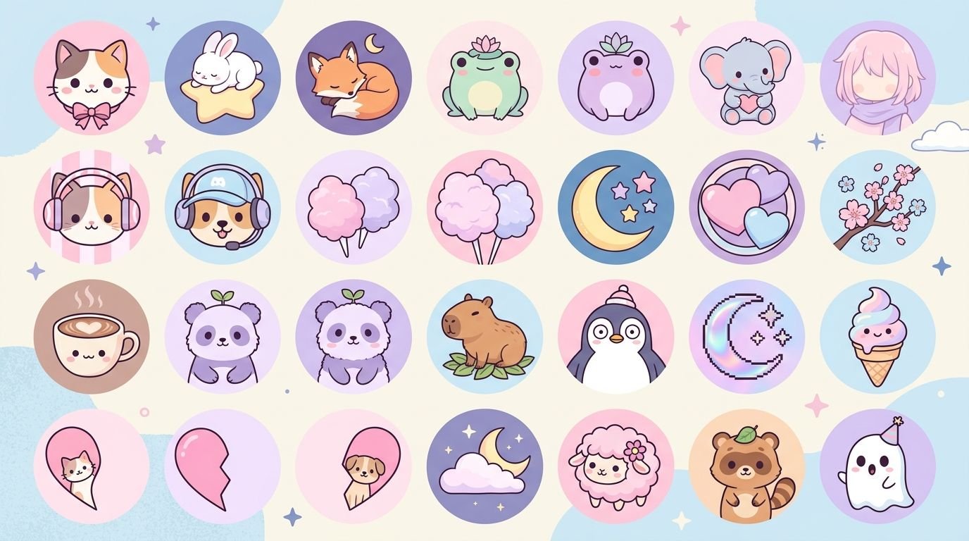
140 Cute PFP for Discord: Aesthetic, Anime & Funny

Published

on

140 cute PFP for Discord featuring aesthetic and kawaii profile picture ideas

Finding the right profile picture can completely change the look of a Discord account. The 140 Cute PFP for Discord ideas in this guide cover soft, aesthetic, anime, funny, matching, gaming, minimalist, and character-inspired styles, so you can choose an avatar that fits your personality rather than settling for a random image.

A good Discord PFP also needs to work at a very small size. Discord displays avatars as circular images, so a picture that looks great as a large square may lose important details when reduced. Discord itself recommends using a simple square image or GIF, with an image around 200 × 200 pixels or larger and under 10 MB.

140 Cute PFP for Discord Ideas

Here are 140 ideas organized by style to make your search easier.

Cute Anime PFP Ideas

  1. Soft pastel anime girl
  2. Chibi anime boy
  3. Smiling anime character
  4. Anime character with headphones
  5. Cozy anime character
  6. Anime character under the stars
  7. Pastel-haired anime character
  8. Cute school-style anime avatar
  9. Anime character holding a plushie
  10. Shy anime expression
  11. Chibi character with oversized hoodie
  12. Anime character with cat ears
  13. Soft pink anime portrait
  14. Lavender anime avatar
  15. Cute anime gamer
  16. Anime character with a coffee cup
  17. Dreamy anime profile picture
  18. Anime character surrounded by flowers
  19. Cute fantasy anime character
  20. Anime character with sparkling eyes

Anime remains one of the easiest styles to adapt into a Discord avatar because expressive faces, strong colors, and recognizable silhouettes remain visible even after the image is reduced. Current PFP searches also commonly separate anime, aesthetic, boy, girl, and matching categories.

Cute PFP for Discord Boys

  1. Chibi boy with hoodie
  2. Soft anime boy
  3. Boy with headphones
  4. Cozy gamer boy
  5. Pastel hoodie avatar
  6. Cute cartoon boy
  7. Boy with messy hair
  8. Boy with cat-ear hoodie
  9. Smiling chibi boy
  10. Boy holding a gaming controller
  11. Soft blue aesthetic boy
  12. Cozy bedroom avatar
  13. Boy with glasses
  14. Cute winter avatar
  15. Cartoon boy with headphones
  16. Boy under neon lights
  17. Minimalist boy illustration
  18. Cute fantasy boy
  19. Boy with a plushie
  20. Sleepy chibi boy

Soft cartoon mascots, hoodies, chibi characters, and relaxed expressions are common choices for users who want a cute masculine aesthetic without making the avatar overly serious.

Cute PFP for Discord Girls

  1. Pastel anime girl
  2. Cute girl with headphones
  3. Chibi girl with hoodie
  4. Soft pink avatar
  5. Girl with flowers
  6. Cozy cartoon girl
  7. Cute girl with glasses
  8. Lavender aesthetic girl
  9. Girl with a plush bunny
  10. Dreamy cartoon portrait
  11. Girl under fairy lights
  12. Cute gaming girl
  13. Soft café aesthetic
  14. Girl with a cat
  15. Pastel fantasy girl
  16. Cute winter girl
  17. Cartoon girl with headphones
  18. Soft sunset portrait
  19. Cute flower crown avatar
  20. Minimalist girl illustration

Pastel colors, gentle lighting, expressive faces, and soft backgrounds are frequently used in feminine Discord PFP concepts. They can create a friendly appearance without requiring complicated editing.

Aesthetic Cute Discord PFP Ideas

  1. Pink cloud aesthetic
  2. Lavender sunset
  3. Cozy bedroom scene
  4. Moon and stars
  5. Pastel clouds
  6. Cute mushroom illustration
  7. Vintage camera aesthetic
  8. Soft flower close-up
  9. Coffee and books
  10. Cute sunset silhouette
  11. Minimal pastel heart
  12. Cloudy sky illustration
  13. Soft blue ocean
  14. Cozy rainy window
  15. Cute candle aesthetic
  16. Pastel butterfly
  17. Dreamy moon illustration
  18. Soft pink sunset
  19. Minimal star icon
  20. Cute pastel planet

Aesthetic avatars usually work best when they have a clear focal point and limited visual clutter. Muted colors, soft grain, natural lighting, and simple compositions are frequently used in aesthetic PFP concepts.

Funny Discord PFP Ideas

  1. Confused cat
  2. Angry potato
  3. Sleepy hamster
  4. Smiling frog
  5. Dramatic duck
  6. Cat wearing sunglasses
  7. Chicken with headphones
  8. Tiny angry penguin
  9. Cartoon potato gamer
  10. Sleep-deprived cat
  11. Funny frog reaction
  12. Shy raccoon
  13. Meme-style hamster
  14. Confused cartoon character
  15. Penguin holding a controller
  16. Cat pretending to be serious
  17. Overdramatic hamster
  18. Sleepy cartoon bear
  19. Funny dog reaction
  20. Smug cat avatar

Funny PFPs are particularly useful in casual gaming and community servers because the avatar can communicate personality without needing a detailed profile description.

Cute Animal PFP Ideas

  1. Baby bunny
  2. Fluffy kitten
  3. Sleepy fox
  4. Baby penguin
  5. Cute bear
  6. Tiny hamster
  7. Pastel frog
  8. Baby duck
  9. Fluffy puppy
  10. Red panda
  11. Cute otter
  12. Tiny koala
  13. Cartoon squirrel
  14. Soft wolf cub
  15. Baby seal
  16. Cute panda
  17. Chibi raccoon
  18. Pastel deer
  19. Tiny hedgehog
  20. Fluffy sheep

Animal avatars have another advantage: they do not need to represent a person’s appearance. A recognizable animal silhouette can remain clear even when the Discord icon is displayed very small.

Matching Cute PFP for Discord

  1. Matching bunny pair
  2. Sun and moon pair
  3. Pink and blue matching icons
  4. Matching cat avatars
  5. Opposite-color hearts
  6. Matching frogs
  7. Two halves of one illustration
  8. Matching chibi characters
  9. Coffee and donut pair
  10. Moon and star pair
  11. Matching panda avatars
  12. Angel and cloud pair
  13. Matching foxes
  14. Red and blue character pair
  15. Matching flower avatars
  16. Day and night pair
  17. Matching bear avatars
  18. Two complementary anime characters
  19. Matching pastel hearts
  20. Matching cartoon animals

Matching PFPs are commonly used by friends, couples, siblings, and gaming partners. Split images, complementary colors, mirrored compositions, and paired characters work particularly well because each individual avatar can still make sense on its own.

What Makes a Cute Discord PFP Look Good?

A cute image is not automatically a good Discord avatar. The image needs to remain recognizable after being reduced to a small circular icon.

Keep the main subject centered

Discord crops avatars into circular shapes. Important details near the corners can therefore disappear. Discord specifically recommends considering the circular crop when preparing an avatar.

A centered face, animal, character, or symbol is usually safer than a subject positioned at the extreme edge.

Use a simple background

A complicated background can compete with the main subject. If the avatar contains a character, keep the background relatively clean.

Choose strong contrast

Light characters against a light background can become difficult to see. Likewise, dark subjects can disappear against dark backgrounds.

A simple contrast between the subject and background can make a bigger difference than adding more decorative effects.

Avoid tiny text

Words that look readable in an image editor may become impossible to read inside a Discord avatar.

If text is essential, use only a few large characters.

Cute PFP Styles Compared

PFP Style Overall Vibe Best For Main Advantage
Anime Expressive Gaming and fandom servers Strong character identity
Chibi Playful Casual communities Very recognizable
Pastel Soft Aesthetic profiles Calm visual appearance
Animal Friendly General Discord use Works without personal photos
Funny Humorous Friends and gaming Shows personality quickly
Matching Connected Friends and couples Creates a shared identity
Y2K Retro Creative communities Distinctive visual style
Goth Dark and artistic Alternative communities Strong contrast
Minimalist Clean Professional or simple profiles Easy to recognize
Gaming Energetic Gaming servers Connects with interests

Cute PFP for Discord: Anime or Non-Anime?

The choice largely depends on the identity you want to create.

Anime PFPs are useful if you participate in gaming, anime, manga, or fandom communities. A recognizable character or art style can immediately communicate your interests.

Non-anime PFPs offer more flexibility. You can use a pet, flower, landscape, cartoon, object, illustration, or abstract design without tying the profile to a particular fandom.

Current Discord PFP searches show substantial interest in both anime and non-anime options, so neither style is inherently better.

Y2K Cute Discord PFPs

Y2K-inspired avatars use visual elements associated with early digital and internet aesthetics. Chrome effects, glitter, pink gradients, glossy textures, retro camera effects, and cyber-inspired graphics can create this look.

The style works particularly well when you want something more distinctive than a standard pastel avatar.

The main challenge is visual clutter. Y2K designs can become busy quickly, so a strong central subject helps preserve the profile picture’s readability.

Goth Cute PFPs

Cute and gothic styles can work together surprisingly well.

A gothic-cute avatar might combine:

  • Black and lavender
  • Bats and hearts
  • Dark clothing with pastel accents
  • Cute skull illustrations
  • Moon imagery
  • Black cats
  • Purple lighting
  • Gothic cartoon characters

The key is contrast. Dark images can lose detail in small icons, so brighter highlights or a contrasting outline can help the subject remain visible.

Cute Discord PFPs Without Anime

Not everyone wants an anime character as their avatar. Good alternatives include:

  • Pets
  • Cartoon animals
  • Flowers
  • Clouds
  • Food illustrations
  • Cozy rooms
  • Nature scenes
  • Minimal symbols
  • Retro objects
  • Cute fictional creatures

These options can create an equally distinctive identity without relying on a recognizable character.

How to Choose the Right Cute PFP

Instead of choosing an image simply because it looks attractive, consider what you want your profile to communicate.

Choose based on personality

A funny cat can communicate a completely different personality from a dark moon illustration.

Consider your main servers

If you spend most of your time in gaming servers, a gaming or character-based PFP may fit naturally. If you use Discord mainly for friends or study groups, a softer minimalist image may work better.

Think about long-term use

A highly specific meme may be funny for a week. A simple animal, character, or aesthetic illustration can remain useful for months.

Test the circular crop

Before uploading, preview the image as a circle. Check whether the face, ears, eyes, logo, or other important details remain visible.

Check it in dark mode

Discord’s interface can make some colors look different from how they appear in an image editor. A dark avatar may lose its edges against a dark interface.

A Small PFP Can Still Have Strong Visual Identity

One commonly overlooked issue with Discord avatars is that detail does not always equal quality.

A highly detailed illustration may look impressive at full resolution but become visually confusing when reduced to an icon. A simpler drawing with a strong silhouette can sometimes be much more recognizable.

For example, a cute fox with a clean background may work better as a Discord PFP than a detailed fantasy scene containing five characters.

The same principle applies to colors. Three coordinated colors can create a stronger identity than a design containing every color in the palette.

Can You Use GIFs as a Discord PFP?

Discord supports animated avatars for users who have access to the relevant profile features. Discord’s own profile guidance notes that avatars can be uploaded as simple images or GIFs.

If you use an animated PFP, keep the movement subtle. Rapid animation can make the avatar distracting and may make important details harder to recognize.

A small looping sparkle, blinking expression, floating heart, or gentle movement can often work better than a highly complicated animation.

How to Make Your Own Cute Discord PFP

You can create a personalized avatar rather than downloading a generic one.

A simple process is:

  1. Choose a central theme such as an animal, character, color, or object.
  2. Pick a visual style such as chibi, pastel, Y2K, minimalist, or gothic.
  3. Use a square canvas.
  4. Keep the main subject near the center.
  5. Use a clean background.
  6. Check contrast between the subject and background.
  7. Preview the image as a small circle.
  8. Export in a supported image format.
  9. Upload it to your Discord profile.
  10. Check how it looks beside your username in an actual server.

Discord’s own design guidance recommends square imagery and notes that avatars are displayed as circles, making the crop an important part of the design process.

Common Mistakes to Avoid

Choosing a blurry image

A low-resolution picture can look especially poor when enlarged or compressed.

Putting the subject at the edge

Circular cropping can remove part of the subject.

Using too many effects

Glow, blur, glitter, particles, text, stickers, and backgrounds can compete for attention.

Copying someone else’s identity

Using another person’s personal photograph as your avatar without permission is a poor choice, particularly if the image is private.

Ignoring copyright

If you use fan art, illustrations, or artwork created by another person, check whether the creator allows reuse. Finding an image online does not automatically mean that you have permission to redistribute or modify it.

Making the avatar too generic

A random aesthetic image may look nice, but a small personal detail can make the PFP much more recognizable.

The Best Cute PFP Depends on Your Discord Vibe

There is no single perfect Discord avatar.

A chibi character may be ideal for a gaming server. A pastel bunny might suit a relaxed community. A funny animal can work well for a friends-only group, while a minimalist icon may be better when you want a cleaner profile.

The goal is not simply to find the cutest image. It is to find an image that remains recognizable, fits your personality, and looks good inside Discord’s small circular interface.

Frequently Asked Questions

What is a cute PFP for Discord?

A cute PFP for Discord is a profile picture designed around friendly, playful, soft, or visually appealing themes. Popular options include chibi characters, anime art, pastel illustrations, cute animals, matching avatars, and minimalist designs.

What size should a Discord PFP be?

Discord’s official profile guidance recommends using a square image around 200 × 200 pixels or larger, with the avatar displayed in a circular crop. Discord also notes that JPG, PNG, and GIF formats can be used, with a file size under 10 MB in the guidance provided.

What are the most popular cute Discord PFP styles?

Common styles include anime, chibi, pastel, aesthetic, cute animals, matching avatars, Y2K, gaming characters, and funny cartoon images. The best option depends on the user’s personality and the communities they participate in.

Can I use an anime character as my Discord PFP?

Yes, many Discord users choose anime-inspired profile pictures. However, if the artwork was created by another artist, check the creator’s usage terms before reposting or modifying it. Using an image publicly available online does not automatically grant permission to reuse it.

Are matching PFPs good for Discord?

Matching PFPs are useful for friends, couples, siblings, and gaming partners. Complementary designs, split illustrations, matching animals, and coordinated color schemes can create a shared appearance while allowing each person to maintain a separate avatar.

How do I make a cute Discord PFP?

Start with one clear subject, choose a visual style, use a square canvas, keep the subject centered, and avoid unnecessary background clutter. Preview the result as a small circle before uploading because details that look clear at full size may disappear in Discord’s avatar display.

Should I use an aesthetic or funny Discord PFP?

Choose an aesthetic PFP if you want a polished, calm, or visually coordinated profile. A funny PFP is better if humor is part of your online personality. You can also combine both approaches, such as using a cute cartoon animal with a humorous expression.

Conclusion

These 140 Cute PFP for Discord ideas cover a wide range of styles, including anime, chibi, animals, pastel aesthetics, funny avatars, Y2K designs, gothic themes, and matching PFPs. The strongest choice is one that fits your personality while remaining clear at Discord’s small circular display size.

Keep the composition simple, center the main subject, use enough contrast, and consider how the image looks in both light and dark interfaces. With those details in mind, even a simple cute illustration can become a distinctive Discord identity.

Continue Reading

Trending

Contact Us Email:- Team3brothers.uk@gmail.com